Get Inspired! 15 Abandoned Cart Email Designs You’ll LOVE!

One of the biggest frustrations as an online store owner is when you see abandoned carts — a customer was filling their cart with your product, but never completed the purchase...they just disappeared. This only leaves you to wonder, what happened? You should find comfort in knowing that this happens all the time to every store. What will make you stand out is what you do about it.
Abandoned carts can happen for any number of reasons. Maybe the customer thought shipping cost was too high. Maybe the customer started to question the product’s sizing or quality. Maybe the customer just got distracted, and simply forgot to complete their purchase. The list goes on and on.
This will always be a factor in your online business — that’s why it’s crucial to have a killer abandoned cart email sequence. If you’ve missed our previous tutorial, How to Set up an Automated Abandoned Cart Email on Your Shopify Store, check that out first to get a take you step-by-step tutorial on different ways to review and recover these abandoned carts through Shopify, to get your customers re-engaged and ready to shop!
Best Practices for Recovering Abandoned Carts — Email Designs
The best way to recover an abandoned cart is to send them an email to either remind or engage your customer with their purchase again. They added your products to their cart for a reason, so your job is to help them confirm their decision. Here are the 5 essential components to include when creating your abandoned cart email(s).
- Creative & Concise Headline: Use a creative sentence to remind the customer of the abandoned product, but keep it short and sweet. Get them back to shopping as soon as possible!
- Product Details: Remind them of what they were going to purchase — if relevant include the color, size, product name and even a photo.
- Call to Action: Insert a “Buy Now” option to help customers navigate more easily.
- Simple Navigation: Make it easy and straightforward for the customer to get back to your website and their product.
- Contact Info: Always important to include this in any customer email, in case they have questions or need help.
Make sure you have the customer’s consent to send emails. It’s important that you follow this practice to avoid being reported. Need help collecting emails? Check out this tutorial.
Here are 15 Email Designs for Inspiration:
1. Madewell
Check out their clever, catchy headline and notice how they include all their product info!
2. Loeffler Randall
This is a great reminder email that's simple and clean with many calls-to-action. Also notice how they incorporate an additional CTA with more product categories the customer may like.
3. NastyGal
Check out their super cute and memorable headline, remember to get creative!
4. Nordstrom
Check out how they include their FAQ section and remind the customer of free shipping and returns.
5. Proactiv
Clean design (super on-brand!) with great images, color scheme and simplicity.

6. Red Rokk
Notice their simple navigation: Contact info (and social links) are in plain sight and the “Resume Your Order” button is in center focus.
7. Red Rokk
This is a great design to not only remind customers of their order but to also create a little urgency.
8. Saks Fifth Avenue
This illustrates a good simple design with product info, and easy navigation back to the site. This design could improve on eye-catching aesthetic! 
9. DebenHams
Another charming headline! Not only that, but the headline text is colorful, easy to read and grabs attention. They also remind the customer of their awesome shipping + delivery! 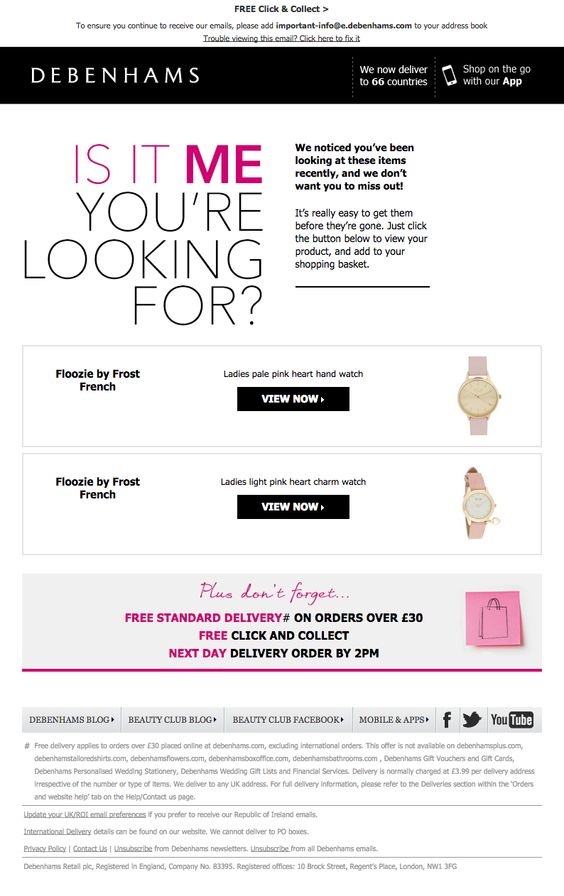
10. DoorDash
Overall just clever, cute and to the point. Short, sweet, and simple while still getting their message across.
11. All Beauty
This one is in need of a noteworthy headline, but it’s a great personalization using the customer’s name and his exact cart info.
12. Food 52
Design is everything here! Soft color scheme, beautiful photos and simple graphics that all compliment one another.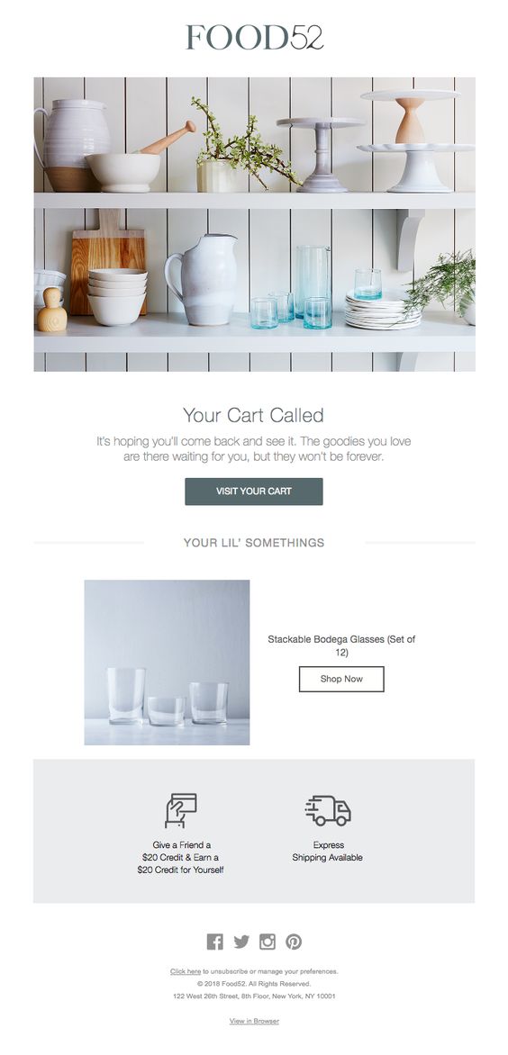
13. Dote
This one will not only get a laugh (or at least a smile) but it’s also got all the necessary info without being overly complicated.
14. French Connection
Although the multiple icons at the bottom could be distracting, the important thing to notice is the “Sale” reminder, what customer wouldn’t love that?
15. Casper
An awesome idea to add social proof to the email if it fits! Make sure the reviews are relevant to the product.
Feeling inspired?
The important thing is to never let abandoned carts get you down. Nearly 70% of online purchases aren’t completed. By designing a fabulous, automated cart follow up email sequence you can actually lead the visitors back to your website and get them to finish their purchase. Your success will depend on how you leverage data and send the right message at the right time. Go get started — but of course, we’ll always be here to help!
Don't Miss Our FREE Email Marketing Guides:


Plus! Take Your Emails to the Next Level
With Our Drag & Drop Email Templates
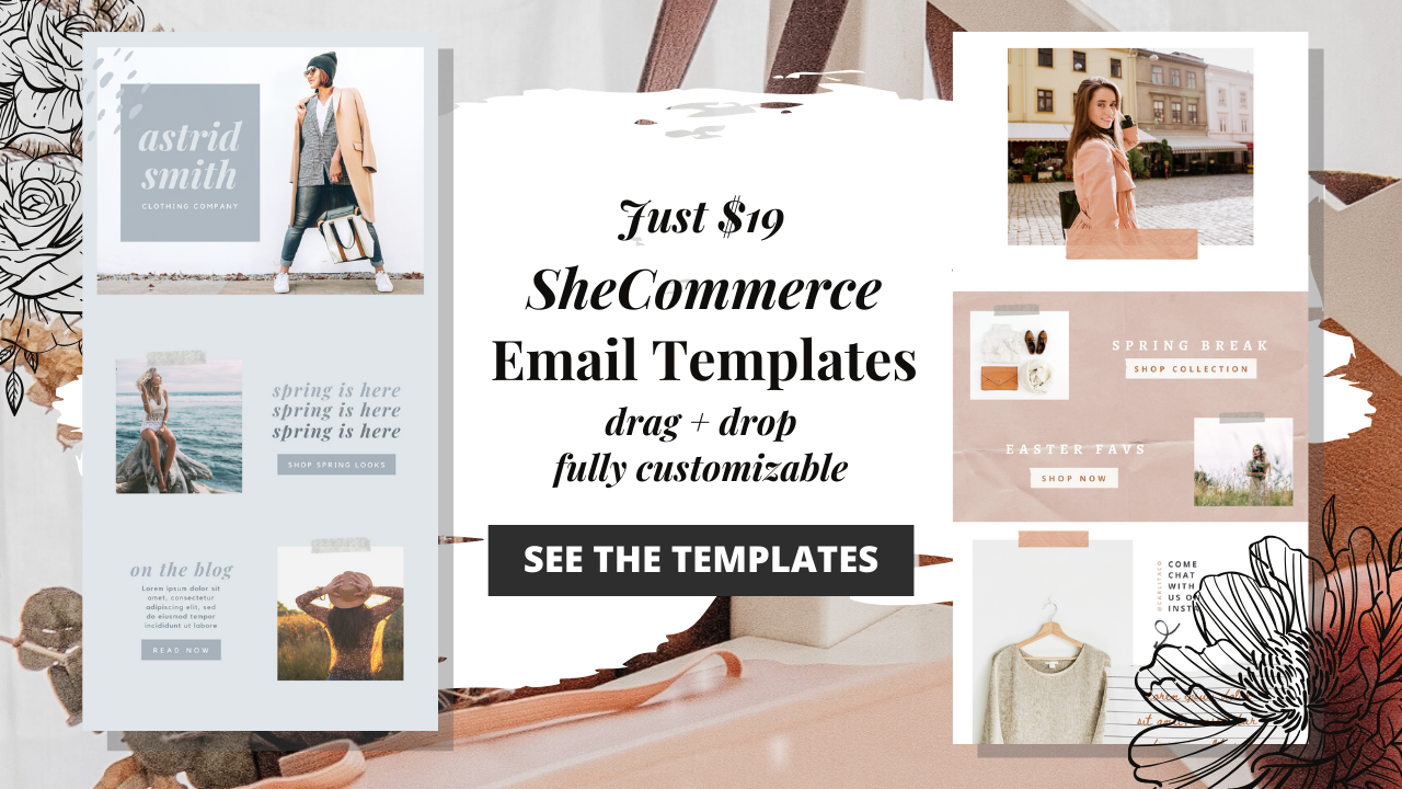
FREE DOWNLOAD
The SheCommerce Handbook for:
Keywords & Hashtags


Recent Posts


